
Website Design Best Practices
A well-designed website guides users effortlessly, clearly communicates value and supports business goals at every touchpoint.
To reach this goal, usability and performance should be a designer’s North Star.
The best website design practices start with a deep understanding of the audience. Clear navigation, a logical structure and familiar patterns are design practices that will lead to more effective engagement.
Modern website design also demands a mobile-first mindset. Most traffic comes from mobile devices. Designers must ensure that layouts, content and interactions work well on small screens before expanding.
Responsive, mobile-first design makes websites easier to use. Additionally, search engine optimization is crucial, as search engines now look at how well websites perform on mobile devices.
Finally, good website design should prioritize page speed, accessibility and an SEO-optimized structure. A good technical foundation will influence how a site performs in search results.
Here are a few points of emphasis for web design best practices:
Prioritize User Experience (UX)
A website should feel intuitive and immediately aligned with users’ goals.
Designers should focus on these principles:
- Design around user goals: What matters most is how easily visitors can complete their intended task.
- Make navigating your website intuitive and predictable: Users should never have to stop and think about where to click next. The link text should be simple, clear and readable.
- Keep key information accessible within one to two clicks: This is the best way to engage.
- Use familiar patterns: Consistently meet user expectations. Use a top navigation bar when there are few pages. Use a hamburger menu when there are too many landing pages. The site header logo should always link back to the homepage.
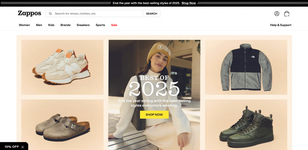
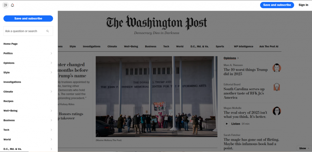
Two good examples of intuitive UX designs include Zappos and The Washington Post. Zappos was cited by SEO research firm Semrush as “one of the best UX design examples in the ecommerce space.” The Washington Post was cited by the Society For News Design as one of the world’s best-designed newspapers.
Design Mobile-First
According to July 2025 research from data firm Soax, 64.35% of global web traffic came from mobile devices.
Mobile-first design focuses on smartphones and small screens from the start. This makes sure the most important content and actions are easy to access. Search engines also favor mobile-friendly websites, making mobile-first design essential for SEO. A site that loads fast, works well on touchscreens, and looks good on larger devices is more likely to rank high and convert visitors.
Here are a few things to keep in mind:
- Build the site to work well on all screen sizes. Begin by designing for small screens. This approach helps designers focus on the most important elements first.
- Use thumb-friendly buttons and spacing to reduce friction and improve usability. Avoid hover-only interactions that do notwork on touch devices.
- Test across multiple devices and screen sizes to ensure consistent performance.
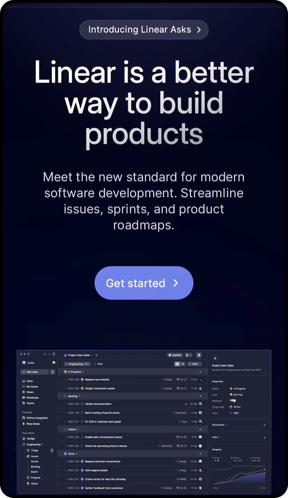
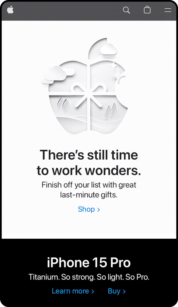
A well-executed mobile-first approach leads to faster load times, better user experience and stronger SEO results.Two good examples of well-crafted mobile designs include Linear and Apple. Both sites were cited by Shopify testing firm GemPages.net; Linear for its “avant-garde website design and lightning-speed load time,” and Apple as “a classic case of responsive website design on mobile, where every detail is accounted for and optimized.”
Build for SEO
Search engines reward clarity and structure.
When you organize your page hierarchy, headings, and content layout from the start, you avoid expensive rework later. This gives each page a better chance to rank for its target keywords. The goal is simple: make it effortless for both people and search engines to understand what each page is about and why it matters.
SEO-ready websites also depend on strong technical foundations. Clean metadata helps increase click-through rates from search results.
Logical URL structures support site layout and internal links. Lightweight front-end choices keep important content visible and fast to load. When you bake these elements into design and development early, you improve visibility, performance and long-term organic growth.
To be SEO-friendly, be sure to:
- Use semantic HTML (H1–H6, sections, labels) to create a clear content hierarchy and accessibility.
- Optimize meta titles and descriptions: Keep meta titles short enough to avoid truncation on SERP results. Incorporate important keywords into your titles and descriptions. Keep meta descriptions under 160 characters.
- Structure URLs logically so pages are readable, keyword-aligned, and easy to categorize.
- Avoid hiding content with JavaScript. This can delay rendering and reduce crawl/index reliability.
Optimize Page Speed and Performance
Faster sites lead to better SEO, lower bounce rates and higher conversions.
Fast-loading pages keep users engaged and help ensure content is accessible across devices and connection speeds. Designers and developers should consider performance from the start. Even small inefficiencies can impact usability and conversions.
To improve page speed, teams should focus on:
- Compressing and properly sizing images. This prevents oversized assets from slowing pages.
- Minimizing scripts and third-party plugins that reduce render-blocking resources.
- Use server-side caching and a CDN to load content faster.
- Avoid unnecessary animations or heavy visual effects, which can slow performance.
Together, these practices create faster, more reliable websites that perform better for both users and search engines.
Use Consistent Branding and Write Clear, Purposeful Content
When visual elements are consistent on every page, users can focus on the message. They won’t be distracted by different colors, fonts, or styles. Strong branding also reinforces professionalism and makes a website more memorable.
Clear, purposeful content works hand in hand with branding to guide users toward action. Well-written copy improves comprehension, supports visual hierarchy and helps visitors quickly understand value.
When content is easy to scan and aligned with the brand’s voice, it creates a seamless experience. Here are a few best practices:
- Stick to a defined color palette to create visual cohesion and reinforce brand identity.
- Use consistent fonts and button styles so interactions feel familiar and predictable.
- Match tone and visuals to brand personality to create emotional alignment and authenticity.
- Ensure logos and imagery are high quality to maintain professionalism and trust.
- Use simple, conversational language that’s easy for users to understand.
- Focus on benefits, not just features to clearly communicate value.
- Break text into short sections to improve readability and scanning.
- Use strong, clear, specific calls to action that are action-oriented.
Test and Measure Continuously
The best websites evolve.
Analytics and behavioral data offer objective insight into what works, what users ignore, and user pain points. By grounding design and optimization decisions in real data, teams can move beyond guesswork and make improvements.
Performance measurement should focus on the full user journey, from first visit to final action. Heatmaps reveal where users click, scroll or hesitate, while conversion tracking highlights drop-off points that need attention. When teams review these insights often, they see how design, content, and performance impact real-world results.
To improve website performance over time, follow these best practices:
- Use analytics and heatmaps to understand user behavior and identify friction points.
- Run A/B tests on key pages to compare design, content, or CTA variations.
- Track user behavior and conversion paths to see how visitors move through the site.
- Iterate continuously by refining design and content based on performance data.
Websites perform best when testing is ongoing. Continuous measurement and iteration ensure that improvements compound over time, resulting in better user experiences, higher conversion rates, and stronger overall performance.

