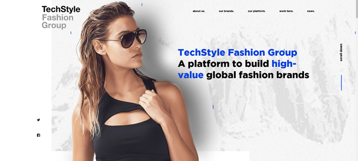
2019 Must Have Web Design Trends & Best Websites
The latest website design trends of 2019 are here. We have searched the internet and have found some unique new ways web designers and developers are creating websites and the design elements they are adding to increase overall experience and usability.
Check out the latest 2019 web design trends and websites that did it right.
Accessibility/Responsiveness
Kicking the list off for website trends 2019 edition is designing with accessibility and responsiveness in mind.
The internet plays such an important role in our lives every day! Practically everyone is searching the internet, whether it be on their laptop, desktop, smartphone, tablet or even fridge. Responsive design is not only a trend but a must in this day in age.
Responsiveness ties into accessibility. Not only is it important to design a website that can be accessed across multiple platforms, but you need to design with equal opportunity in mind. Your website should offer an equal experience and opportunity for everyone.
Who did it best?
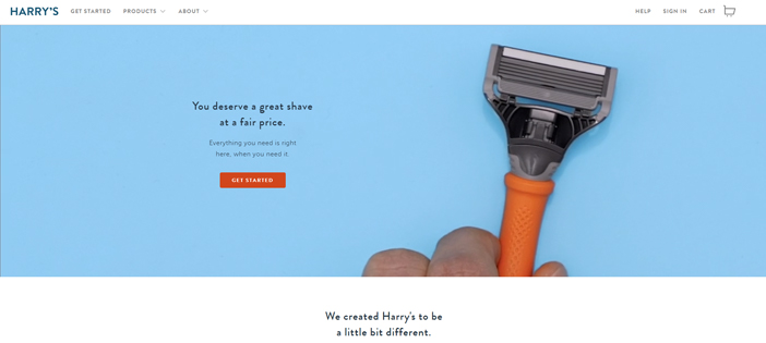
Chat Bots
Chat Bots are web developing trend of 2019 and are a way to increase engagement on your website.
Chat Bots are becoming more and more popular in website design. The main purpose they serve is to be a spot where a visitor can actively have a conversation with you or machine-learning bot.
They don’t necessarily add any creative or artistic value to your web design but are a must-have when developing your website in 2019. It is all about engaging with your audience and building relationships. That is exactly what a Chat Bot contributes to.
Who did it best?
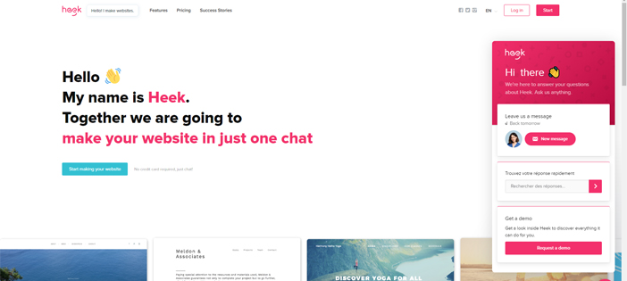
Minimalism
It is a timeless web design trend that is always a good choice to implement.
Taking a minimalistic approach when designing your website will create an overall better user experience. Minimalism eliminates unnecessary web elements that can distract the user. A simple layout, a bold color scheme and a popping call to action are all you need to have an appealing website.
Who did it best?
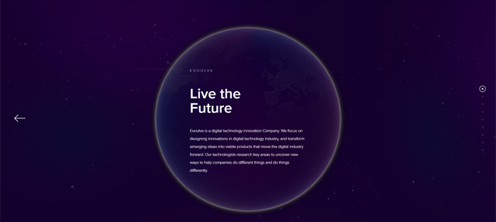
Use of White Space
Coming from the minimalistic trend, designers and developers are going a step further with the “less is more” mindset.
In 2019 we are beginning to see more use of white space. White space doesn’t actually have to be white but is just a term for sections of your website with absolutely no content. It is also referred to as empty space and is used to break up your web page sections.
Who did it best?
Flat Design
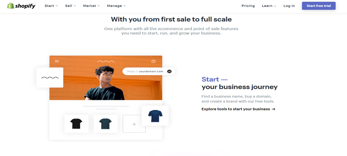
Flat design is another adaption of the minimalistic design trend.
It combines the use of both the white space and overall minimalism web design trends. It has become a standard for how websites are designed today.
Websites that have a flat design eliminate loads of unnecessary data that might slow down the website. Bright color, simple illustrations and empty space are used most when creating a flat design website.
Who did it best?
Serifs on Screen
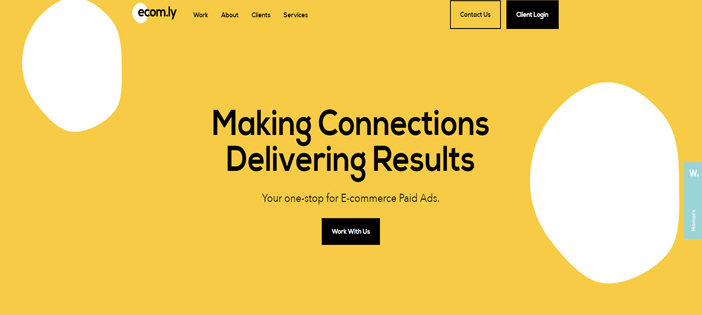
In design, the rule of thumb has always been sans serifs are for the screen and serifs are for print.
In 2019, web designers and developers are breaking the norm. Sans serifs have always been used because they are easier to read. However, we are seeing many major brands incorporate Serifs in headers, logos and call to actions. It is a new way to catch the eye of the reader.
Who did it best?
Glitch Art
Every list of new trends has some twist on a blast from the past.
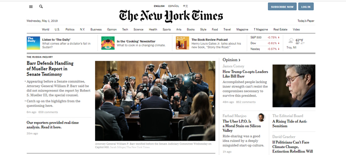
Glitch art is a form of retro design gone wrong. In a world where everything is supposed to be perfect and technology is supposed to operate at its highest potential, having a design that pays respect to the time when technology wasn’t perfect has become a big web design trend.
This trend is the use of distortion, blurred images, skips and color saturation to design your website. It is meant to remind people that not everything needs to be perfect. Glitch art gives the website an overall psychedelic and imperfect feel.
Who did it best?
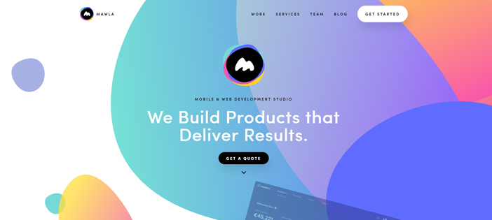
Organic Shape Designs
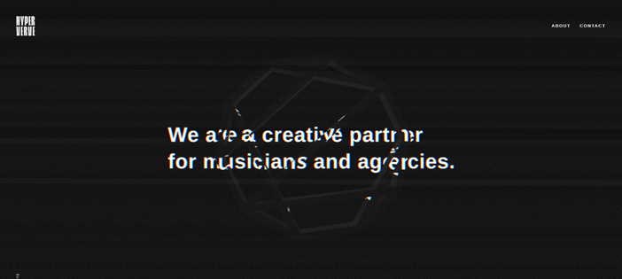
Organic shapes are shapes that are irregular and typically have curvature.
They add a personal touch and depth to a website, making it stand out. It is one of the more effective web design trends of 2019 because it is shown that organic shapes actually grab and pull the reader’s attention.
When done correctly, it can add a personal touch to the website you are designing by getting away from what is considered the non-organic shapes that typically are used to design websites.
Who did it best?
Micro-interactions
Micro-interactions are events that happen on your website that are meant to surprise the reader.
It could be beep when refreshing a page or a small animation when hovering over an image. Those little extra features are called micro-interactions and are a huge trend of 2019.
They give your website character and can create a unique user experience. They can be tricky though because to many can cause distraction or even slow your website down entirely.
Who did it best?
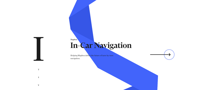
Asymmetrical Layout/Broken Grids
For as long as we can remember not only just website design but all design, in general, has followed some form of grid system or layout.
One of the web design trends we are seeing more often is designers and developers going outside the grid and even breaking it entirely. Since design has been around grids have been used to keep content, images and other aspects aligned and consistent throughout the website.
An asymmetrical layout allows designers to have more creative freedom when designing websites. However, it is a dangerous game to play, since if it is not done correctly you could be creating a horrible user experience.
Who did it best?
